Picture this: You’ve poured your heart, soul, and maybe even your last dime into launching your dream startup.
Now, it’s time to reel in customers, but how? Enter the powerhouse-landing pages for startups.
These aren’t just any web pages; they’re your digital handshake, your opening pitch, and often, your one shot at a killer first impression.
Here, it all converges-the art of conversion optimization, the science of user engagement, and the magic of A/B testing that ensures your call-to-action buttons practically leap off the screen.
In the following paragraphs, we’ll dive into crafting landing pages that don’t just look great but work tirelessly behind the scenes.
Boosting your conversion rates? Check. Lowering that daunting bounce rate? Double-check.
With insights into page load speed, mobile responsiveness, and heatmaps, you’ll come away with tools to refine your customer acquisition efforts.
Be ready to convert those curious clickers into devoted customers. Let’s transform your landing page from a mere entry point to an unforgettable customer journey.
Selling the Sizzle: Making Your Page Pop
First Impressions Matter: The Headline Game
Ever open a book and can’t get past the title? It happens on the web too.
A headline’s your big hello, your opening act. Make it sing, make it dance, make it matter.
A good headline on your landing pages for startups can grab ’em and won’t let go.
It’s about sparking curiosity and telling them, “Hey, you need this, and here’s why.”
Turn Visitors Into Fans: Converting Browsers into Buyers
Landing pages for startups? It’s not just a fancy term; it’s your tool, your weapon. It’s how you turn curious clickers into customers.
Startups need to hit the ground running, and a kickin’ landing page can get you there.
From leads to sales, from maybes to yesses, it’s where it all starts. Make it strong, make it speak, make it yours.
Serving Up the Sizzle: Landing Pages for Startups
Choosing the Right Words: Feelings and Punches
Let’s talk words. You know, those things that either make people yawn or jump off their seats? When it comes to landing pages for startups, you want the latter.
A good word’s like a little punch. A great one? That’s a knockout.
- Be Clear: Tell them what’s up. No fluff.
- Be Bold: Use words that feel. Words that hit the heart. Or the gut.
- Be You: No jargon, no clichés. You’re not a robot. Don’t talk like one.
Selling the Dream: It’s All About the How, Not the What
Benefits Over Features: What’s In It for Them?
It’s like cooking. Features are your ingredients; benefits are the taste. Tell them why it’s good, not what’s in it.
Ever heard of WIIFM? It’s not a radio station. It’s what people are thinking: “What’s in it for me?” Answer that, and you’ve got them.
Telling a Story: Because Everyone Loves a Good Tale
People love stories. It’s in our DNA. Your landing pages for startups should tell a story too. A story of need, desire, solution.
And don’t forget about SEO. Big word, simple idea. It means your page should be friendly to search engines. Talk like a human but think like Google.
Keeping It Real: Easy on the Eyes, Easy on the Brain
Fonts. Sizes. Spacing. It might sound boring, but it’s where the magic happens.
- Fonts: Keep it simple. Fancy looks great on wedding invitations, not on web pages.
- Spacing: Give your words room to breathe. Like a good wine.
- Readability: Make it easy on the eyes. They’ll thank you for it.
Landing Pages for Startups: The Art of Looking Good
Making it Pop: Text and Visuals in Harmony
Imagine walking into a room. It’s clean, everything in its place. You feel at ease. That’s what landing pages for startups should feel like.
- Clean and Crisp: White space isn’t just empty space; it’s breathing room for your words and images.
- Images That Speak: Pictures aren’t just decorations. They tell your story. They’re your friends.
A good balance between visuals and text? It’s like a great song, where every note hits just right.
Being Friendly: It’s Not Just About the Computer Screen
We live in a world where you’re as likely to browse a website on a phone as on a computer. Maybe more.
- Think Mobile: Small screen? Big impact. Landing pages for startups have to look good everywhere.
- Know Your People: Who’s visiting your site? What do they use? Think like them. Design for them.
It’s not just about looking good; it’s about being good. That’s the way of the web world.
User Experience (UX): Treat Your Visitors Like Royalty
Ever been to a store where everything’s just easy to find? That’s UX. It’s making your visitors feel at home.
- Color Your World: Right colors, right emotions. They’re the welcome mat of your site.
- Guide Their Way: Don’t just tell them where to go; take them there. Make the journey fun.
Making Eyes Happy: Visuals Done Right
Choosing the Stars: Images and Videos That Shine
Ever watched a movie that stays with you long after it’s over? That’s the power of visuals.
- Quality Counts: Blurry images? Pixelated videos? No way. Not on your watch.
- Space to Breathe: Your images need room too. Give them space. Let them shine.
Keeping the Vibe: Your Brand, Your Soul
What’s your story? What’s your vibe? Your landing pages for startups should scream YOU.
- Be You, All the Time: Every image, every word should be a piece of your brand.
- Show, Don’t Just Tell: Images that don’t just decorate but define.
Speeding It Up: No One Likes to Wait
You know how annoying it is to wait for a slow-loading webpage. Don’t be that page.
- Keep It Light: A page bogged down by heavy elements is like a car stuck in mud.
- Optimize, Optimize: Fast loading isn’t a feature; it’s a must. Make it happen.
In a world where people leave a page if it takes more than a few seconds to load, speed isn’t just nice to have; it’s life and death.
Landing Pages for Startups: Your Voice in the Crowd
CTAs: Your Handshake to the World
Where to Put Those Buttons?
So, you got your landing pages for startups ready, and you want folks to do something. You need to reach out and say, “Hey, over here!”
- Place ‘Em Right: It’s about more than just having buttons. It’s about putting them where people can see ’em. Where they’ll want to click.
- Offer Something Cool: Give them a reason. A good reason. “Click here, and we’ll help you out” kinda stuff.
You want them to connect? Make it easy. Make it fun.
Talk the Talk
You can’t just wave and smile. You’ve got to say something. Something that makes ’em think, “Yeah, I want that!”
Use Your Words: “Get it now.” “Join us.” Simple, clear, to the point. That’s what a CTA’s gotta say.
Make It Pretty But Strong
A button’s gotta be more than just pretty. It’s gotta stand out. Be different.
Colors that Sing: Don’t just paint it; give it life. Make it something they want to click.
Trust: You Gotta Earn It
Trust. It’s a big word. And in the world of landing pages for startups, it’s everything.
Real People Saying Real Things: Testimonials. Reviews. Let your happy customers talk for you.
Show Off a Little: Got some big names loving your stuff? Flaunt it. You earned it.
Seals and Badges: Not Just for Scouts
You got them? Show them.
Make ‘Em Feel Safe: Badges and seals aren’t just decoration. They tell your visitors, “We’re legit.”
Who Are You?
People want to know. They really do.
Your Team, Your Story: Who’s behind all this cool stuff? Show ’em. Make them feel like they’re part of something.
Perfecting Landing Pages for Startups: A Guide to Testing and Tweaking
The Art of A/B Testing on Landing Pages
So, landing pages for startups are like your shop’s front window. You want everything to look perfect, but what looks good to you might not to others. That’s where A/B testing comes in handy.
Try two versions of your page. Change the colors, or maybe switch up the buttons. Whatever feels right.
Then, watch and learn. See which version makes people stick around. That’s your winner. Repeat the process to keep making things even better.
Understanding Your Audience Through Metrics and Data
Alright, this one’s about the numbers. You’ve gotta know what’s working and what’s not. Tools like Google Analytics can help.
They’re like a magnifying glass on your landing page. You can see what people are clicking on, where they’re spending time, all that stuff.
Keep an eye on those numbers. Find out what makes people tick. And don’t be afraid to mix things up if something’s not working.
Making Small Changes, Big Results: Iterating and Refining
Ever heard of iterations? It’s like making tiny tweaks to something until it’s just right. Think about cooking a recipe and adding just a pinch more salt each time until it’s perfect.
So, take your landing page and change just one thing. Maybe it’s the big headline or the color of that “Click Me!” button. Test it out. If it works, awesome! If not, change it back or try something else.
Iterating like this can make a huge difference. It’s all about finding what’s just right for your audience, your product, your vibe. And the best part? You can do it all yourself. No need to wait around. Just test, learn, and keep going.
Digging Deep into Successful Landing Pages for Startups
So, you’re looking to create a landing page for your startup.
Well, guess what?
You’re not alone, and there’s a bunch of cool examples out there to inspire you.
Shopify
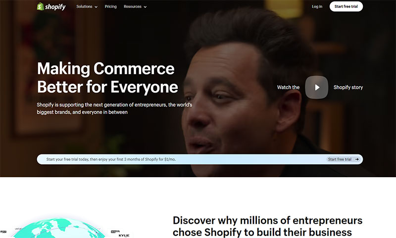
What’s cool about Shopify’s page? It’s all about the user.
A catchy headline, some simple graphics, and boom, you’re ready to get started with online selling. Not too much fuss, just what you need.
Sunbasket
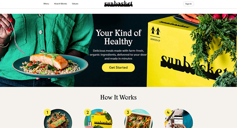
Ever heard of Sunbasket? They’ve got this neat trick where they compare themselves to their competitor, Blue Apron.
By saying “We’re better because…”, it’s like laying out the facts, making it clear why they’re the winning choice. Smart move, right?
Codeacademy
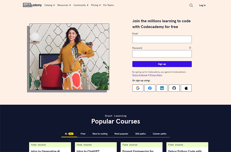
Let’s talk Codeacademy. They made the landing page easy for anyone, even if you’re new to coding.
You sign up quick, with social logins if you want. Plus, real success stories are right there to tell you, “Hey, you can do this too!”
Slite
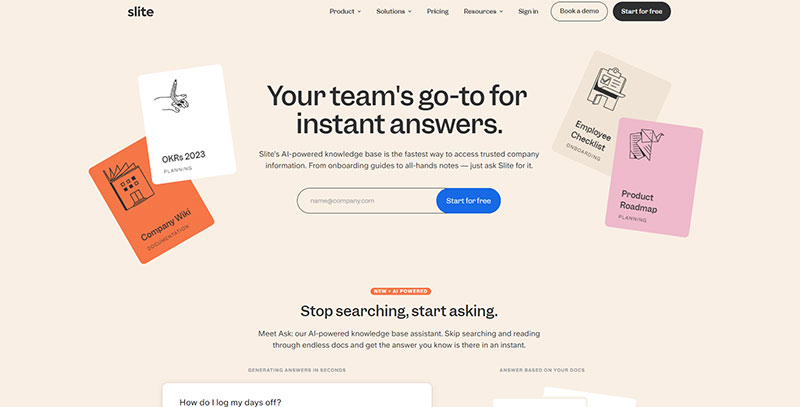
Slite is like your team’s personal Google. It’s an AI-powered knowledge base that gives you instant answers to your company’s FAQs.
Imagine a digital library that knows exactly what you’re looking for. From onboarding guides to meeting notes, Slite has got you covered.
It’s a game-changer for startups looking to streamline their internal comms and keep everyone on the same page.
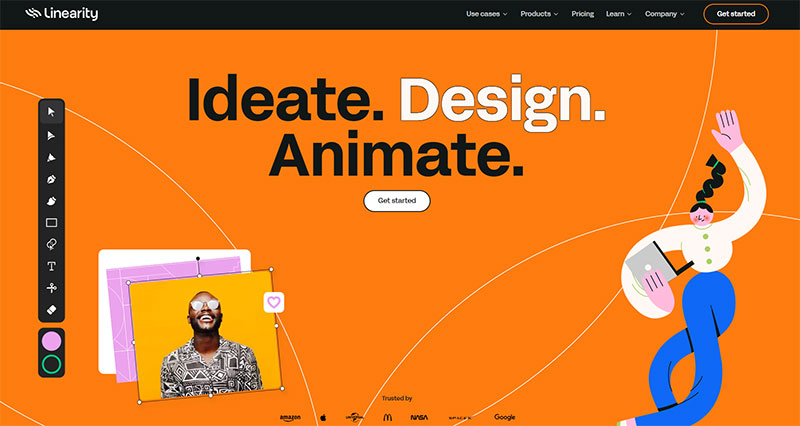
Artboard Studio
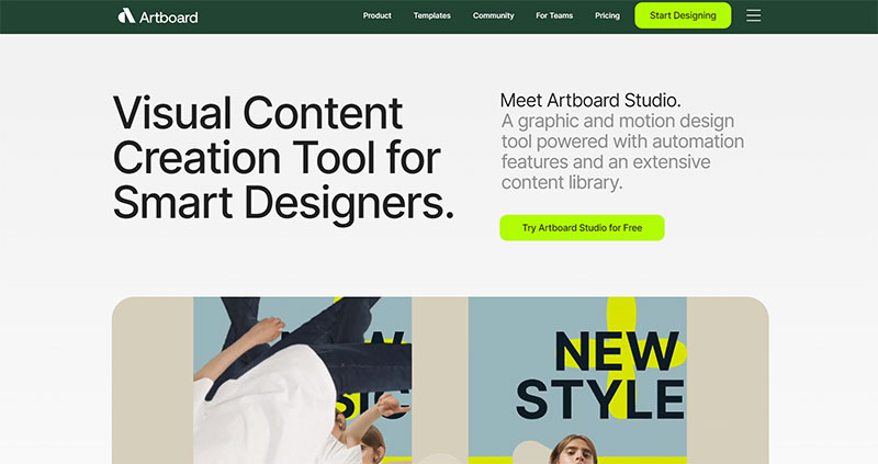
Artboard Studio is the Swiss Army knife for designers. It’s not just a graphic design tool; it’s a full-fledged creative suite that lets you design, animate, and even automate your work.
You can create a single design and then generate thousands of variations. Perfect for startups that need to pump out high-quality visuals without wasting time.
Glide
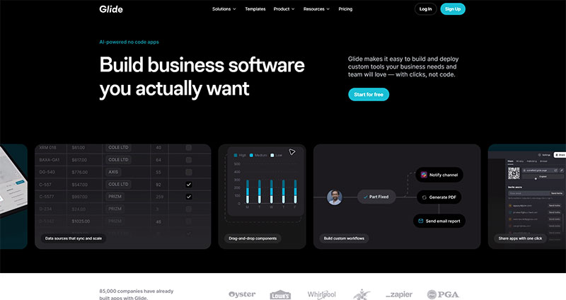
Glide is like having a developer in your pocket. It’s a no-code app builder that lets you create custom business tools with just a few clicks.
You can integrate it with your favorite tools and even use AI to power your apps. It’s perfect for startups that need to get an MVP out the door, like, yesterday.
Attio
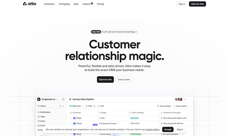
Attio is the CRM that plays well with others. It’s super flexible, letting you tweak every little thing so it fits your business like a glove.
It’s not just about deals; it’s about any business process you can think of. If you’re a startup looking for a CRM that can grow with you, Attio is where it’s at.
Evergreen
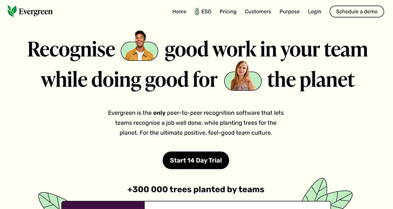
Evergreen is the feel-good software your team didn’t know they needed. It’s a peer-to-peer recognition tool that lets you give props to your teammates while also planting trees for the planet.
It’s like getting a high-five and saving the Earth at the same time. Ideal for startups that want to build a positive team culture and make a difference.
Jitter
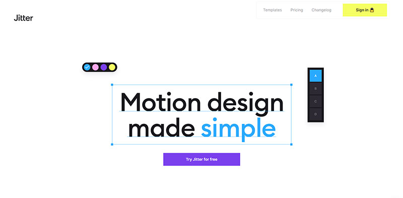
Jitter is your go-to for creating animated content that pops. Think of it as your digital sketchbook but for animations.
You can design everything from UI/UX animations to social media posts. It’s like having a mini animation studio right at your fingertips.
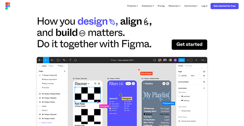
Plus, it integrates with Figma, so your workflow is as smooth as butter. Ideal for startups that want to bring their visuals to life without breaking a sweat.
Prismic
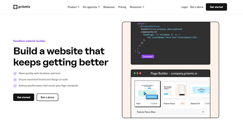
Prismic is the unsung hero of website building. It’s a headless website builder, which means it separates the front-end from the back-end, giving you more control and flexibility.
You can create dynamic, on-brand pages without needing a degree in computer science. It’s the dream tool for startups that want a website that evolves with them.
Dock
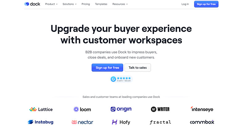
Dock is like your virtual handshake with clients. It’s a client-facing workspace that makes everything from sales proposals to onboarding a breeze.
It’s not just a tool; it’s an experience that impresses buyers and turns them into loyal customers.
A must-have for startups that are serious about customer relationships and closing deals.
Bolt
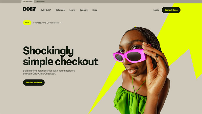
Bolt is the magic wand for your checkout process. It turns the tedious task of checking out into a one-click wonder.
It’s not just about making sales; it’s about building lifetime relationships with your customers.
Bolt shoppers are more likely to return, making it a win-win for startups looking to boost both sales and loyalty.
Overflow
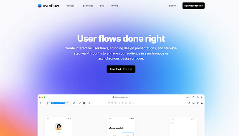
Overflow is the go-to platform for designers who mean business. It’s not just about creating pretty visuals; it’s about crafting user journeys that make sense.
Imagine having a tool that lets you seamlessly integrate your designs into interactive, playable user flow diagrams.
Yeah, that’s Overflow for you. It’s like the Spotify playlist for your design elements, all interconnected and ready to be played by anyone who wants to understand your design logic.
Mixpanel
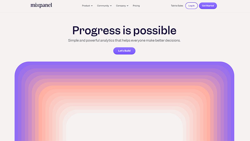
Mixpanel is the data scientist’s dream tool, but you don’t have to be one to use it. It’s all about understanding user behavior on your app or website.
Think of it as the Google Analytics on steroids. You can track user interactions down to the tiniest detail, like what button they clicked or how long they hovered over an image.
It’s the ultimate tool for those obsessed with user experience and data-driven decisions.
Dashlane
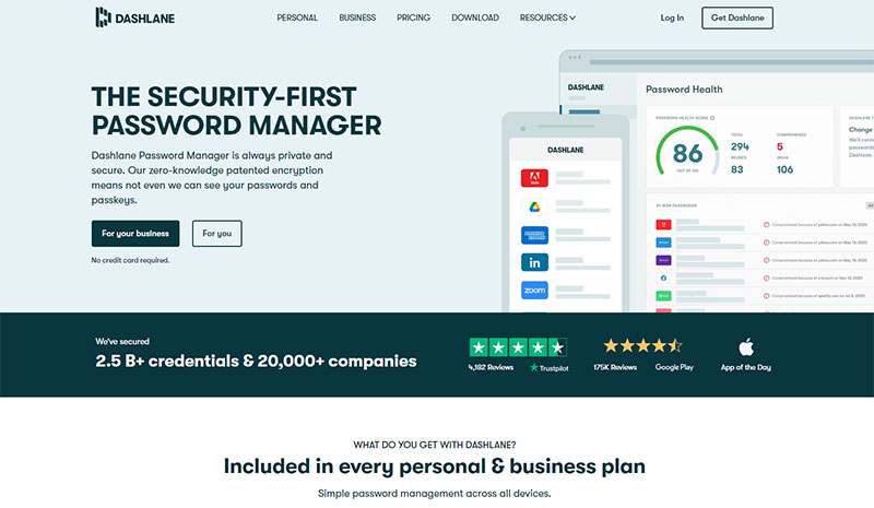
Dashlane is your digital guardian angel. Forget about sticky notes with passwords scribbled on them.
Dashlane securely stores all your passwords, payment info, and personal details in one place.
It’s like having a super-secure vault in your pocket. Plus, it auto-fills forms for you. So, next time you’re rushing to snag that limited-time online deal, Dashlane has got your back.
Craft
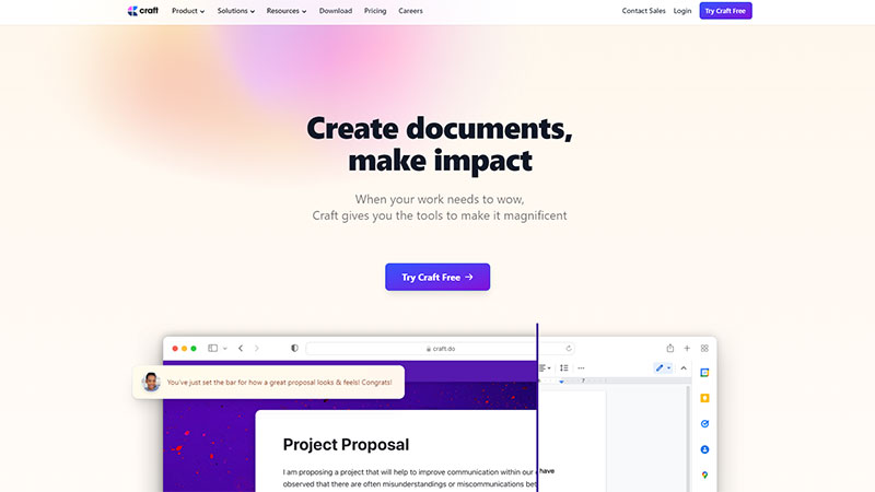
Craft is where creativity meets productivity. It’s not just another document editor. It’s a space where you can bring your ideas to life.
Whether you’re drafting a proposal or jotting down your next big idea, Craft offers a seamless experience.
It’s like having a digital canvas where you can paint your thoughts, complete with AI assistance to make your writing shine.
Circle
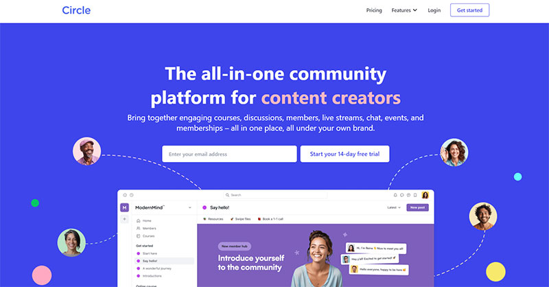
Circle is the community builder’s paradise. Whether you’re a brand, a coach, or just someone with a following, Circle helps you create a thriving online community.
It’s like having a virtual town square where your audience can gather, discuss, and even attend events. It’s flexible, customizable, and integrates well with other platforms.
So, if you’re looking to build a community that resonates with your brand, Circle is your jam.
Literal
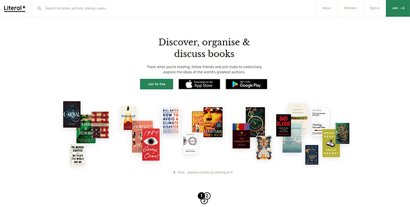
Literal is the book lover’s social network. Forget Goodreads; this is where the real bookworms hang out. Track your reading, join book clubs, and even scan book barcodes.
It’s like having a virtual library that also lets you peek at what your friends are reading.
Whether you’re into fiction, non-fiction, or anything in between, Literal is your go-to platform for all things books.
Stark
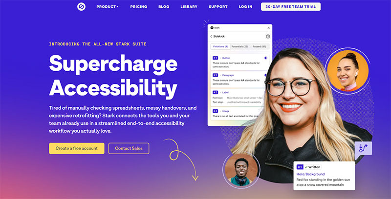
Stark is your go-to for making digital products accessible. It’s like having an AI-powered sidekick that scans your design files and spits out ways to make them more user-friendly.
From Figma to Chrome, it’s compatible with all the design tools you already love. So, if you’re a startup looking to make your landing pages more inclusive, Stark is your jam.
Learning from Others: Inspiration and Guidance
Alright, so you’ve seen what others are doing. Now, what about your landing page?
The thing is, landing pages for startups are all about getting to know your visitors and turning them into something more, like customers or fans.
Here’s a quick checklist:
- Appealing Aesthetics: Make it look good.
- Less is More: Keep it simple, no need to overdo it.
- Keep Visitors on the Page: Don’t distract with extra links.
- Social Sharing: Let people spread the word.
- A/B testing: Try different versions, see what works.
- Call-To-Action: Tell ’em what to do next.
FAQ On Landing Pages For Startups
How vital are landing pages for startup growth?
They’re pivotal. They act like a laser-focused digital front door, directing potential customers straight to your offer.
Think of it as a rapid-fire pitch to your visitors-maximizing conversions and starting the customer journey off on the right foot.
What elements make a landing page effective?
The secret sauce? Clarity and simplicity. A killer headline grabs attention, while a persuasive subheading keeps it.
Add in a clear value proposition, engaging visuals, and a bold, no-nonsense call-to-action, and you’re golden. Plus, user experience-make it seamless, make it swift.
How do you measure a landing page’s success?
Analytics are your best friend here. It’s all about conversion rates, click-through rates, and dwell time.
Use tools like Google Analytics to track these metrics, and never underestimate the power of A/B testing to refine and optimize.
Can you build a landing page without coding skills?
Absolutely! Platforms like WordPress and website builders offer templates that make you look like a pro without knowing a line of code.
Plus, these templates are often optimized with SEO best practices in mind-the less hassle, the better.
How important is the page load speed for landing pages?
Crucial-it’s non-negotiable. Even a second’s delay can cause valuable leads to bounce. Optimize images, leverage browser caching, and don’t go overboard with heavy scripts.
Speed means more engagement, and more engagement means better conversion rates.
Is A/B testing necessary for landing pages?
Think of A/B testing as tuning your guitar before a gig-it’s essential. It gives you real-world insights into what resonates with your audience, from CTA placement to color schemes. Fine-tune based on data, not guesses.
How do you drive traffic to a landing page?
Diversify your methods. Pair SEO best practices with paid search engine marketing and social media marketing.
Then, dip into content marketing strategy, email campaigns, and maybe even partnerships. It’s about being visible in a sea of digital noise.
What role does content play on a landing page?
Content is your pitch. It’s how you communicate your startup’s value and establish trust. Every word should encourage action and reflect the unique selling proposition.
And don’t forget social proof-testimonials that back up your claims are incredibly persuasive.
How does mobile responsiveness impact landing page performance?
In today’s world, if you’re not mobile-friendly, you’re not in the game.
With more people browsing on their phones, your landing page has to shine on small screens too-think big touch targets, streamlined content, and quick load times for a solid user experience.
What’s the best call-to-action for a startup’s landing page?
It’s less about the ‘best’ and more about what’s right for your startup. The call-to-action has to align with your unique selling proposition.
Make it bold, make it bright, and most importantly, make it impossible to ignore. Try “Get Started” to denote a journey rather than “Buy Now” which feels final.
Conclusion
So, we’ve journeyed through the digital mecca that landing pages represent, especially for those fresh on the startup scene. Safe to say, they’re game-changers, right? This isn’t just a fancy digital flyer; this is your brand’s beacon, lit up in the vast sea of the internet, guiding potential customers home-to you.
Let’s recap the gold nuggets:
- Design with heart, but always back it up with data.
- Every element is a chess piece in the grand scheme of user engagement; place them wisely.
- Page load speed? It’s not just important, it’s everything.
- Never rest on your laurels; A/B test like the wind.
- Drive traffic as if your startup’s life depends on it. Because, well, it does.
Here’s the thing: a landing page is your first handshake, your opener, your deal-maker. Nail this, and your startup’s narrative begins not with a whisper but with a roar!
If you liked this article about landing pages for startups, you should check out this article about finding startup companies.
There are also similar articles discussing finding a cofounder for your startup, how to bootstrap a startup, financial plan for your startup business, and remote startup jobs.
And let’s not forget about articles on questions to ask a startup before investing, starting a business but having no ideas, UK startup accelerators, and Australian incubators.